A solution to transform public transportation into a safer environment for bus and skytrain commuters.
BEACON is a community-driven platform that lets skytrain and bus commuters send anonymous alerts to each other. Users can seek help without attracting attention by anonymously creating a 'right now' connection with those immediately around them using Bluetooth 5.0 (no pairing required). With Beacon, users can commute with a peace of mind knowing that the nearby crowd—not distant authorities—
can help when needed.
Industry: Safety/Transportation
Year: 2018
Location: Vancouver, B.C.
PROBLEM SPACE
People take the public transportation because it's convenient, but they feel their safety is threatened when they encounter unwanted behaviour. They don’t know what to do.
"group drunk middle-aged men brought liquor onto train and started harassing people. People had to leave on the next stop"
"There was once a drunk person on the train just randomly yelling at people and pushing them, I just hoped they wouldn't reach me."
"Nothing happened. There was no translink people coming up to deal with it."
"I had to leave the stop and wait for the next skytrain"
Duties:
Discovering Problem Space
Validating Assumptions: Primary/Secondary Research
User Personas
Experience Maps
User Stories
Ideation, Sketching, Lo-fi/Hi-fi Greyscale Wireframes
High-Fi App Designs
Prototyping with Invision
HOW MIGHT WE?
How might we make public transportation a safer environment in order to allow commuters to seek help without attracting unwanted attention?
DISCOVERY
01. SECONDARY RESEARCH
Secondary research is needed to understand what types of apps are already out in the market, which address the problems of safety on public transportation. It is also to see what the city of Vancouver or other cities in the world have been doing in the physical space to make public transportation a safer environment.
Current Initiatives/Solution:
Brighter lighting in and around skytrains, bus stops, bus, skytrain stations
Increased number of transportation staff patrol
Surveillance cameras
Women-only subway carts/bus
Apps which send-off distress signals to your family and friends, giving your location and opening up a video recorder
silent trigger alerts on buses and skytrains
texting police – 87 77 77
After completing secondary research, I came up with a hypothesis/assumption that :
Women feel unsafe when taking the public transportation in Vancouver. They’re not aware of what they can do when their safety is threatened.
02. SURVEY RESEARCH
Overall Participants
In order to validate my hypothesis/assumption I did a survey research using Google forms to understand the different commuters who take public transportation in Vancouver. I wanted to understand their behaviour - Why is it they take the public transportation? What do they do on the transit to keep themselves occupied? Have they encountered unwanted scenarios? What happens when they do? What are their overall feelings towards the public transportation in regards to safety? (these were only some of the questions).
In result, my assumption/hypothesis was incorrect. People generally felt safe taking the public transportation, but it's times when they've encountered non-emergency situations - they're unsure of what their options are. They didn't want to dial 911 or press the emergency alarm - having their identity revealed. In that case, many decided to ignore the situation or hop off and on to another bus/skytrain. Women weren't the only ones who encountered situations where they needed help - men also had their concerns.
My problem space shifted from women having a general concern for safety while taking the public transportation to what can bus and skytrain commuters do when they're faced with a non-emergency situation (grey area).
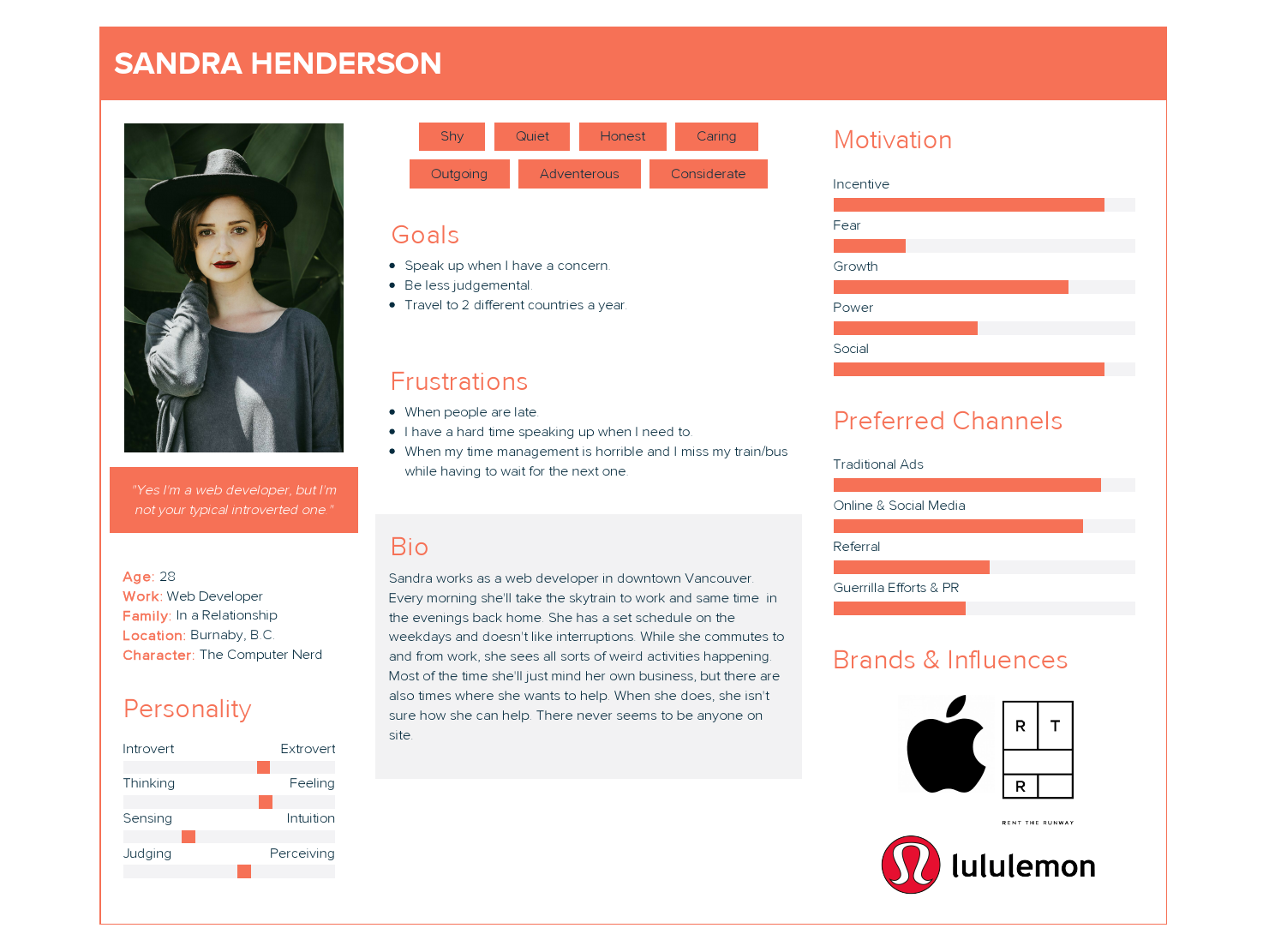
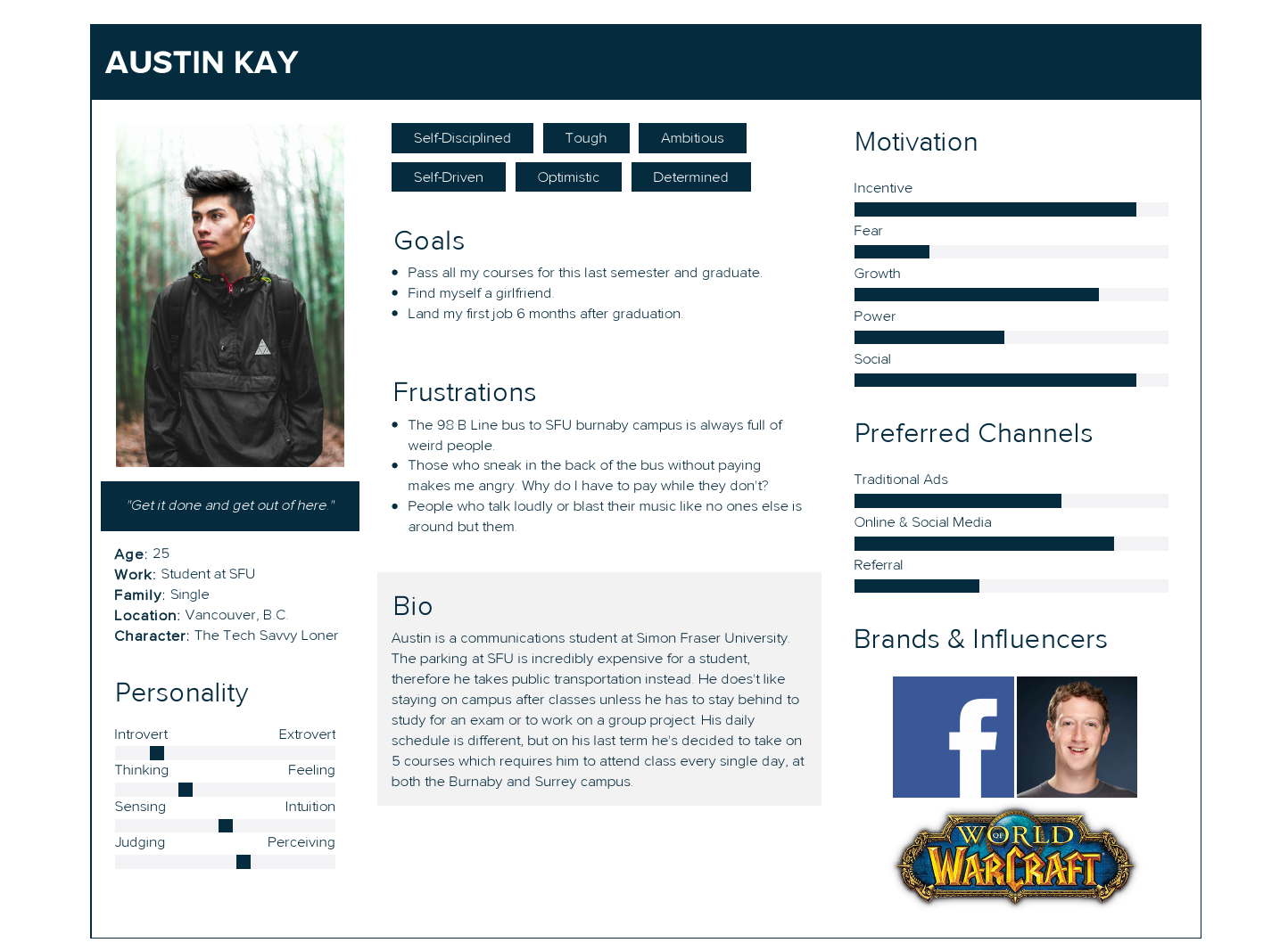
03. PERSONA CREATION
Next steps were to create two different personas - Sandra who is a web developer and Austin a student at Simon Fraser University based off of survey research results.


04. EXPERIENCE MAP
This was one of my favourite and most confident part of the project - being able to put myself in the user's (Sandra) shoe and walking through their journey into the discovery of my app - Beacon.
Interaction Touchpoints:
Lowest point - sees an unpleasant situation on the skytrain, not sure how to report or ask for help
Mid point - discovers Beacon which can provide an alternative way of physically stepping in to confront the situation (risking her own safety)
Highest point - a peace of mind when an alert has been successfully broadcasted to those around her, knowing she's not alone
APRROACH/FRAMEWORK
05. USER STORIES
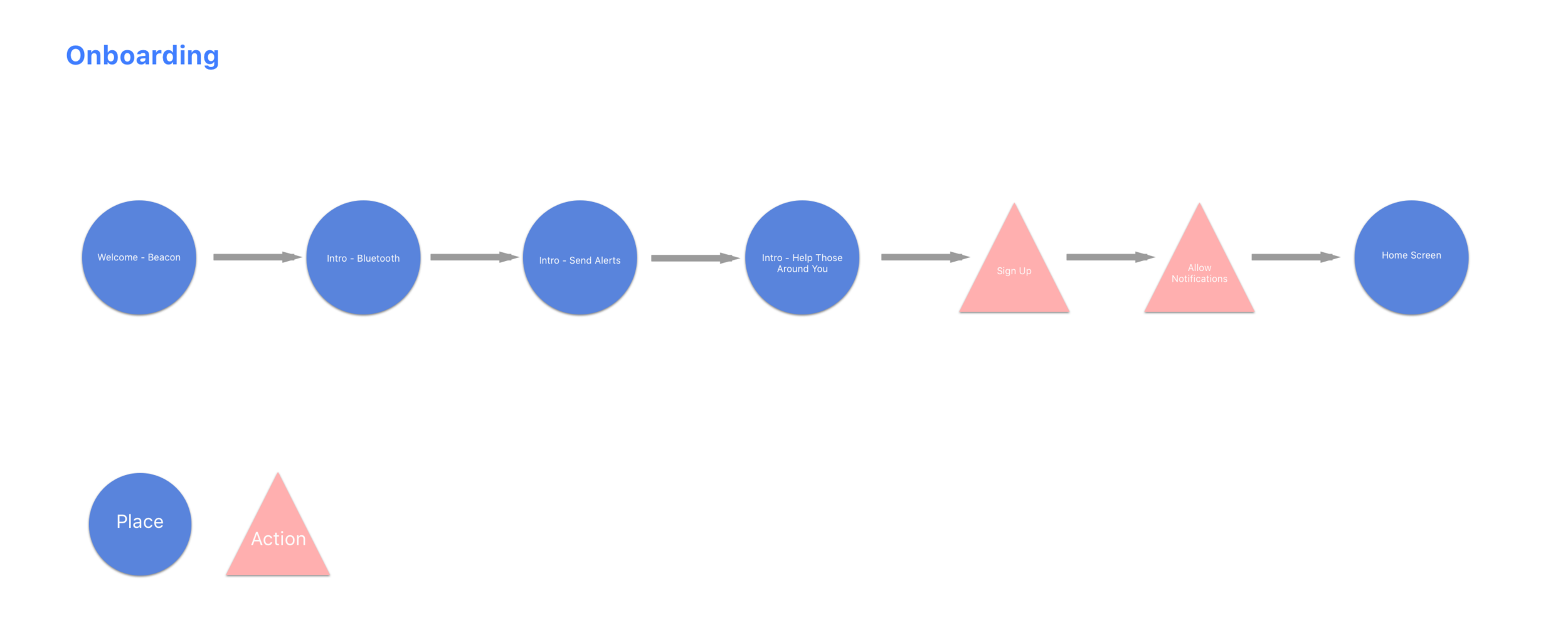
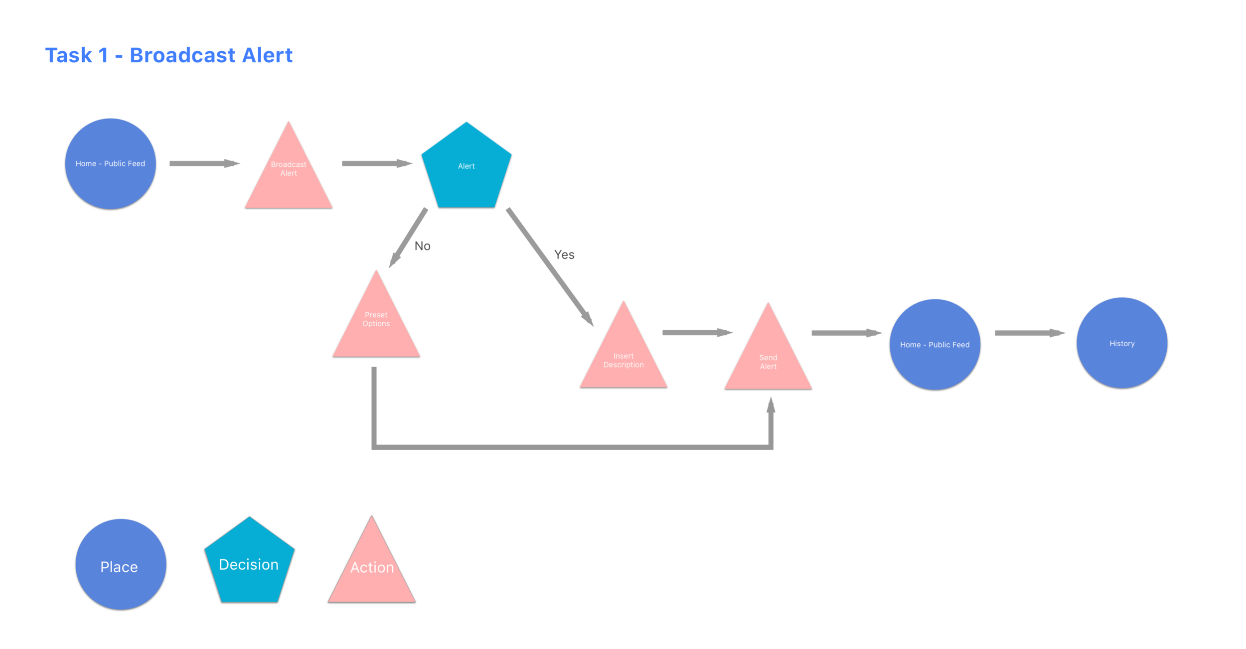
06. TASK FLOWS


IDEATION
07. ROUGH SKETCHES
08. WIREFRAMES (Created with SKETCH)
Greyscale Lo-Fi Wireframes
First digital wireframes created for Beacon.
User Testing Results - First Round with Greyscale low-fi wireframes
Elaborate usability tests are a waste of resources. The best results come from testing no more than 5 users and running as many small tests as you can afford.
There needs to be more clarity between the Alerts that are being shown on the feed
Provide more context for the quick prompt
- what are quick prompts?Unnecessary to have a new page when you can just type right into the text box
- "why can't I type right into the description box?"Overall needs more context in order to provide users a better understanding of what the app does. Although more context was needed, users were able to navigate through the task of sending out an alert.
- users weren't sure as to where they were in the app (add headings?)Navigation bar is quite important - when navigating to History the navigation bar should still stay at the bottom instead of a full screen
More clarity and consistency was needed for on-boarding
- It isn’t clear as to what the app does
- logos don't correspond to the description“Hesitant in entering my number if i’m not sure what its for”
- why do users need to enter their phone number - give context
- is it necessary for a full name when users are suppose to be anonymous?“Are the alerts in chronological order?”
- The heading “feed” seems weird
- consider adding time stamps to the alert to give it more context
- what do the triangles mean? are they placeholders for images?"Since there are only three on-boarding screens, take away the skip option and have users go through it"
- reconsider how important on-boarding is
Greyscale Hi-Fi Wireframes
On-boarding screens
Task 1 - Broadcasting an alert
- this is when I decided to make the switch and start designing on an iPhone X art board
- I wanted to keep up to date with the newest technology and to see what it would look like when mirrored onto my own iPhone X
User Testing Results - Second Round with Greyscale hi-fi wireframes
clear CTA buttons
more context overall to give users a better understanding
"I know where I am in the app"
users liked having the option to take a photo when entering text
you're not able to enter text right into the description box without it opening up a new screen
"the time stamps on the feed are in a weird area, I almost couldn't see it"
"I'm still not liking the name, feed"
"I have something to say seems very blunt" is there any other way to make it more user friendly?
users were able to understand the overall task flow
even without text to describe the navigation bar, users were able to distinguish the icons
Visual Identity
Colour
The main colour for Beacon is blue - represented by the first 3 (#407EFF / #5984DC / #007AFF). Three types of white are used to create negative space and to emphasize information. All other colours are used on icons and to represent their different states.
Associated with open spaces, freedom
Positive effects on the mind and the body
Communicates significance, importance, and confidence without creating somber or sinister feelings
Typography
San Francisco Designed by Apple
Easy to read in any text size and on any device
The font for the digital age - ex. Apple device (iOS)
Legibility is the main reason why it is used - since Beacon is more text-based than image-based.
San Francisco is the only font used but with different weights to showcase text hierarchy.
Logo Design
Dictionary Definition of Beacon:
A fire or light set up in a high or prominent position as a warning, signal, or celebration.
Although the second logo was not used, I decided to put the signal waves onto the wordmark for the responsive website
The waves represent a signal that is being sent and received - aligns with the main feature of Beacon (broadcasting and receiving alerts)
Final Logo Design
An object rather than a letter is used for the logo because people associate lighthouses as beacons of light.
Apps that use a letter for their logo are more likely productivity-based.
UI Library
13. High-Fidelity Designs
On-boarding & Validation
No profiles are needed for Beacon—all sent and received alerts are anonymous. Only your phone number is needed for verification purposes in order to maintain a positive community free from unrelated and unwanted behaviour. With Beacon's simple yet robust on-boarding process, users can expect out-of-the-box and easy to use functionality.
Alerts Card Advanced View
Alerts is the home screen where you'll be able to view different skytrain/bus alerts along with nearby alerts that are broadcasted by other commuters around you. These screens show the flow of an advanced view of one of the alerts, also giving you the option to share that alert to other social platforms, message platforms or through email.
Task 1 MVP - Broadcast an Anonymous Alert
When designing the entire sending task flow, Sandra (persona) was always kept in mind, in order to correctly address the research (user's pain points).
Here is the scenario for Sandra:
You are Sandra. While taking the skytrain, you witness a man secretly taking photos of other women. You want to alarm other’s of this man. Broadcast a message to people in your proximity!
History Advanced View
In My History you're able to see a history of the alerts you've sent out. You'll also be able to see how many people have viewed that alert to give you a sense of confidence that you're not alone.
FINAL PROTOTYPE
Try out the prototype HERE
Thank you and the end.
Why Create Beacon?
For someone who comes from a Criminology background, I wanted to create a solution that would help with crime prevention and help those who have been victimized. Although there is no ultimate solution that can solve all problems in the Criminology field, public transportation is known for its high numbers of criminal activities—which is why I decided to focus on this area. I’ve seen deviant activities occur and I’ve also been a victim of harassment on public transportations. During these moments, I felt defenceless and without options - I didn’t know how to seek or provide help. Unfortunately, I’m not the only one that has felt this way. It’s time for the crowd to step in and help, whether as a silent, anonymous witness or a Good Samaritan that takes action, because the end result is safer public transportation for everyone—something we can all get behind.


